
Word Press Themes, CSS and a request for help
I’ve been thinking about redesigning my site for some time. It first appeared on the net in the back end of 2005, with a nice, blocky white-and-one-other colour feel to it. Not something that by any standards that could be described as a nice site design, but then I wasn’t a site designer, I was a developer.
And then after a few months — probably around January 2006, I launched the “badly-drawn-cat†version of the website, which was styled to look like a desk, with post-it notes, and scraps of paper making up the site. This was better — it looked like it had been designed by an enthusiastic amateur web designer, but it still didn’t really have a professional feel to it.
I had quite an attachment to the badly-drawn-cat, both as a kind of a site logo, and also in terms of the overall design. It was the first real design I’d done myself. Sure, it was far from perfect, but it was also a hell of a lot better than the previous version.
And then when I moved to WordPress as my blogging engine in the middle of 2006, after briefly experimenting with one of the common WordPress themes, I customised Mike Cherim’s Seabeast theme, keeping his layout and all the clever PHP stuff he’d done, but changing the images and the colour scheme, and incorporating a few other minor tweaks here and there.
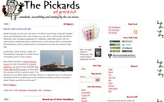
Resulting in The Web Chemist theme, which features down the right hand side my old friend the ethanol alcohol molecule (or a stylised version thereof).
However, the part of my site that isn’t powered by my blog — the family tree bit — still uses the old “badly-drawn-cat†styling. On the one hand, I’m quite fond of this for various sentimental reasons, but on the other hand I think it looks a little crappy having two versions of the site. And the main reason there are two versions of the site is I don’t really understand the structure of Mike’s CSS well enough to make significant changes, or to customise my existing styles to match it.
Which brings me to my third option. I want to create my own theme for the site. I still wouldn’t describe myself as an expert designer, but my skills in this respect have come a long way in the last two years, and I’d at least be prepared to describe myself as a competent designer now.
It’s going to be a great deal of work to build my own WordPress theme, particularly and for this reason there’s a few people I’m going to hope will accede to specific requests and/or help with specific questions, but I’d also appreciate comments, thoughts, ideas and help from anyone else.
I’ll tell you what I’m thinking about at the moment (of course, there’s no guarantees I’ll continue thinking about it this way.
Firstly, the site will be XHTML 1.0 Strict. I’m used to writing XHTML 1.0 Strict, served as text/html so I’m going to stick with that, and given that my posts to date have all been written with that in mind, anything else could result in significant problems. Therefore I really don’t want to know why you think HTML 4.01 Strict, Transitional or even XHTML Strict served as xml would be better. It’s going to be XHTML 1.0 Strict, and that’s non-negotiable.
Secondly, and this will come as no surprise to anyone who’s been here before, I’m planning that the site won’t use tables for layout. I’m going to be relying on the old CSS, doncha know?
Thirdly, I’m wanting an elastic three column layout, with a relatively thin left hand column holding information and links relating to my site, followed by the main post details, with a right hand column holding information and links that relate to external sites. You all still with me so far?
Next, I would ideally like the columns to be of equal height, but this is maybe something I’m prepared to compromise on (but I’d rather not). I’d like a header that goes across all three columns at the top, and a footer that goes across all three columns at the bottom. Again, I could maybe live without the footer, but I’d rather keep it. Of the two, I guess I’d rather lose the footer than the equal height columns…
You still with me?
Any advice on the best way to do this — tutorials and so on — will be greatly appreciated, although I want to find something that works across different modern browsers (I don’t care if it looks ugly in old browsers, providing it’s still accessible), and that uses valid XHTML 1.0 and CSS, and doesn’t have a whole pile of problems associated with it.
Please note therefore that I’m making a deliberate decision to take advantage of the improvements made to the CSS support in Internet Explorer 7 and am considering IE6 to be an old browser that it’s allowed to look ugly in.
I’d also like to consider having the content first in the code with the left hand column being positioned there via CSS, if you can add that into my wish list while you’re on.
In a change from my previous designs, I’m also putting serious consideration towards going for a light text on a dark coloured background style. I’ll obviously be checking the colour contrasts with Gez’s tools, but I want to know if there are any problems or issues specifically relating to light-on-dark design, and if so, what I can do to avoid or at least minimise these.
Finally, any ideas for background images would also be appreciated, in terms of the sort of motif for the site. I have a few thoughts of my own, but I’m open to suggestion too…
Obviously, you don’t have to help, but if you come to this site and read it anyway, you’ll probably already have an opinion on it’s visual appearance, even just sharing your thoughts on what you do and don’t like currently would be a start, if you don’t fancy going as far as offering suggestions for my new look.
Gareth Rushgrove says:
February 5th, 2007 at 9:15 pm
When you say elastic do you mean elastic in the Patrick Griffiths sense of using em’s, or rather using %?
I can knock you something up if you like? Alternatively I’d start with the classic faux columns article by Dan Cederholm.
In terms of any order columns have a look at Any Order Columns on Position is Everything or if you agree with Shaun that using floats to do this is a little unstable then you can try Clearing absolute positioning with a little JavaScript.
Drop me an email if you want an assist - always glad to help and layouts one of my things.
JackP says:
February 6th, 2007 at 7:13 am
Gareth,
I’m looking for the left and right columns to be a percentage with min- and max-widths - and the middle column to take up the rest of the space. Ideally I’d have the middle column having a maximum width so that on some super-wide monitors, the display doesn’t fill the whole screen…
I’ll probably be in touch for help a little further down the line, then
Seb Crump says:
February 12th, 2007 at 2:31 pm
Sorry for being a bit slow on this one, you may have already got past needing these links reading your more recent post on this topic - but I thought I’d add them to the mix in case they’re useful to anyone else considering this course of action…
Firstly, I think I know you’re not a Mac user (so you’d need to substitute your own Win equiv software), but for the process of things this article may be of interest: Wordpress Theme Development Workflow for OSX.
Secondly, Smashing Magazine have an article listing 83 Beautiful Wordpress Themes You (Probably) Haven’t Seen. They also had a great bookmarkable resource round-up of 53 CSS-Techniques You Couldn’t Live Without
Seb Crump says:
February 13th, 2007 at 8:58 am
You’ve probably got passed the point for these links, but I thought I’d post them anyway in case they’re useful for you or others considering doing the same.
Firstly, I think I know that you don’t use a Mac, but the folowing may be useful from a process perspective if you substitute in equivalent Windows software: Develop a WordPress theme on your Mac
Secondly, Smashing Magazine has several articles that may be of interest, including 83 Beautiful Wordpress Themes You (Probably) Haven’t Seen and 53 CSS-Techniques You Couldn’t Live Without.
Hope the comment gets through this time - I’ve tried a couple of times, but it’s just disappeared - maybe becuase I was putting too many links in?