
Engineering For Accessibility Part 1
Microsoft have made their e-book Engineering for Accessibility available as a free download, which is obviously a good thing. I would obviously urge anyone who cares about accessibility to read it, because while the book relates to software rather than web design, the basic principles behind accessibility are the same, and if it helps you to produce more accessible websites, software, or even just develop a better understanding of accessibility, then this has to be positive.
But for those of you who are a little put off by its somewhat weighty nature (102 pages and close to 25,000 words), I have done my usual thing of having had a little read through to bring you a summary of some of what I believe is the key information.
Introduction
It starts off with a little background information, an introduction to accessibility if you will, but then throws in a statistic that may well startle many:
A 2003–2004 study commissioned by Microsoft and conducted by Forrester Research found that over half—57 percent—of computer users in the United States between the ages of 18 and 64 could benefit from accessible technology. Most of these users did not identify themselves as having a disability or impaired but expressed certain task-related difficulties or impairments when using a computer. Engineering for Accessibility
It then goes on to talk about impairment types, what the effects of these impairments are, and what AT solutions are available. This contains nothing new to people who already have a good understanding of accessibility, but some of the issues and solutions — mobility impairments and the head-tracking mouse — may be new to some.
One important point raised is that many software applications already include things which are of benefit to some types of cognitive disability — many calendar applications allow users to set reminders, which can be a critical aid to anyone with memory issues.
Like most computer tech books, the authors feel that their is a need to throw in a lot of jargon and TLAs: whether or not you already know that a UI is a user interface, and UIA is user interface automation is somewhat beside the point: it’s possible to explain the same point using much plainer English and it’s a shame that so many techies (and here I’m not just pointing at Microsoft) feel the need to dress things up in fancy language.
The book describes its two key considerations as programmatic access and keyboard access. Basically, if the features and details of your application are exposed programmatically, AT such as screenreaders can pick up on it; if you can access the program using a keyboard, you are not dependent on a mouse. Two very simple principles which underpin an awful lot of accessibility.
What Microsoft do very well with this book is back it up with further information which is available online: they provide a list of resource links organised by chapter, such as guidelines for keyboard user interface design.
Again, there’s nothing in here that’s rocket science: keyboard interface design can be summed up as:
- Provide keyboard access to all features (and document it)
- Keep keyboard navigation quick, easy, and consistent
- Do not require multiple keys to be pressed simultaneously (except for CTRL, SHIFT and ALT, which can be done using the Windows StickyKeys accessibility feature
- Ensure tab order is correct
It is important to consider also that just because you’ve learned how to make stuff accessible on t’interwebs, and because you’re aware of assistive technology that works on the web, does not mean that you necessarily know how it works elsewhere. While the focus of the book is very much on the Microsoft Windows platform, principles relating to it can potentially be transferred to other platforms. For example, if you have designed an application with default colours, you should check that the colours you have used are still properly differentiated if you view the application in one of the ‘high-contrast’ windows modes.
The documentation references colour contrast and suggests that you should ensure the contrast between text and background is at least 5:1 (3:1 for larger font sizes). This is pretty much the same as the AA level success criterion 1.4.3 in WCAG 2.0 (albeit a smidge stronger). You’re also advised, pretty much again backing up the Web equivalents, not to use colour as the primary way of presenting some information.
The UI Automation Environment
Intended for interoperable implementations by other companies, Microsoft’s UI Automation (UIA) Community Promise is a specification that provides information about Microsoft’s accessibility frameworks, including Active Accessibility (MSAA), UI Automation (UIA), and its shared implementations. Engineering for Accessibiity
In other words, what Microsoft does to expose the details of controls and applications to assistive technology. For the most part, I don’t really believe it’s that necessary to understand the technical details of how the UIA stuff works, just so long as you are using it correctly so that it does. Therefore for the most part I am going to skip this bit as not only is it not the bit that I am specifically interested in, but it is also not the sort of thing which is easy to summarise. I will however note that if you are developing your own controls, you need to ensure that they adhere to the appropriate specifications.
Designing the Logical Hierarchy
For anyone who has previously designed an application, there’s a procedure you go through. You know what functions the users want the system to contain (if you’re lucky). The question is ‘how do you get them from system startup to access those features?’. And that is precisely what we’re looking at here.
It’s about making the logical structure a visible structure that is exposed and accessible to the users. In other words, make it look the same way it behaves. Again, ’tis neither rocket science nor brain surgery, it’s just one of those design principles which has embedded itself into my head as “the way we do things” without having any high-falutin’ technical terminology attached to it.
Although, for anyone who is an inveterate tinkerer with applications (whether .NET, Microsoft Access, or whatever), there is a key piece of information:
Identify the controls to create the UI. Use framework controls whenever possible and not custom controls. When using framework controls, use them as they were intended. Any irregular or nonstandard use of a control often leads to bad usability and accessibility.Engineering for Accessibility
Again: use the stuff for what it is usually used for. That way the users won’t have to re-learn a different control set for your non-standard application.
And then we come to the stuff which ought to be patently obvious, but in my experience is not always so. Names. Nearly every developer I have known, and certainly every development environment I have worked in, seems to think the most important part of any standard is a naming convention. People can indeed get quite worked up as to whether every combo box in your application should be prefixed com_ combo_, or something else, and indeed whether every variable used anywhere should have an int_, lng_, txt_ or similar prefix to let you know what they are about.
And then, it has also been my experience that people don’t actually bother to adhere to the naming conventions, despite putting so much energy into bickering about what they should be. And in many cases, they are missing the point.
If the name of the control is made available to assistive technology, the important thing is not that the name has some sort of code which would enable a developer to best understand how it is deployed within the program: the important thing is that a user who sees the name would understand what the control is for.
AT programs and their users depend on the Name Property of an element, so be sure to include an accessible name with each element that you map. Consistent naming practices are very important. An accessible name should be consistent with the UI text on-screen, for example.Engineering for Accessibiity
It is very easy when creating an application which uses a lot of form controls simply to accept the names they are automatically given by the system, particularly when visually it looks okay, because you’ve added a text label alongside it. But it’s not just controls which are positioned nearby which are important for assistive technology: it’s the settings of the control itself you’re looking for.
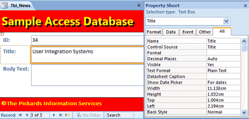
As you can see, in the example above, the purpose of the highlighted control is to hold the field Title, and the name of the control is set appropriately for this purpose.
It then goes into some detail about how you can draw this sort of mapping, if you’re working in one of those development environments where people actually take documentation seriously, instead of just stating that they take documentation seriously…
There is then a very useful little table which lists all of the Control types supported in UI Automation. Again, this is primarily set out from a .NET point of view, but it is incredibly useful for people to see the sort of thing which is exposed to the assistive tech.
Then, again demonstrating that accessibility has exactly the same principles whether on or off the web, they look at the difference between decorative and contextual graphic elements. For example, with .NET, non-control and non-content elements can be filtered out by setting the appropriate properties (IsContentElement and IsControlElement) to false.
The second part of this feature will follow tomorrow…
garment news daily says:
July 28th, 2011 at 6:22 pm
Visitor recommendations…
[...]one of our visitors recently recommended the following website[...]……
invisible fence products says:
October 27th, 2012 at 7:56 pm
invisible fence products…
ThePickards » Engineering For Accessibility Part 1…
Prajapati says:
November 6th, 2012 at 6:41 am
Hi Ted,In theory, I agree that use of aria-describedby is the beettr choice, but in practice at the moment, aria-describedby is less robustly supported across AT/browsers/OS’s than aria-labelledby. Also the content in this case will will be recieved by a screen reader user in the same way if either is used i.e. the label and labelledby or the label and describedby, text will be announced when the control recieves focus.